Visual identity and website for a construction digital‑twin consultancy.
2025
Client
The Grid
The Challenge
Create a modern, clear, and relatable identity that positions The Grid as a leader in the digitization of the construction sector, bridging physical and digital worlds.
The brand must convey precision, innovation, and trust, aligned with its manifesto (data transforming the built environment), and scale across web, decks, social, and technical docs. Keywords: BIM, digital twins, workflow automation, IoT, real‑time data, multi‑stakeholder collaboration, applied research.
The Grid
What we did
Industry
Construction · Digital‑twin tech · B2B
Approach
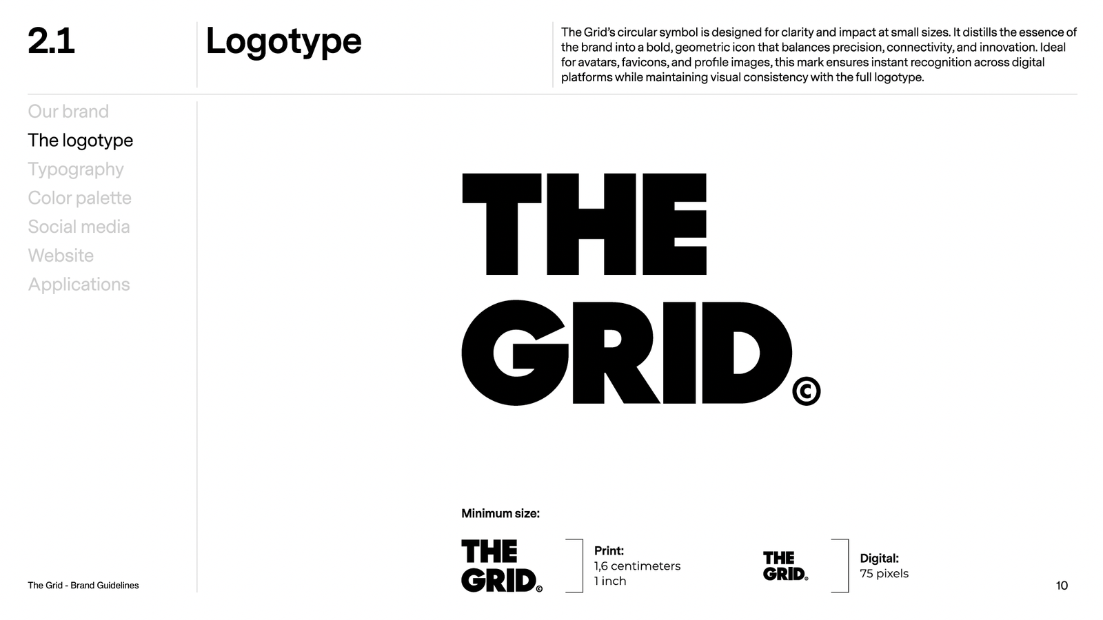
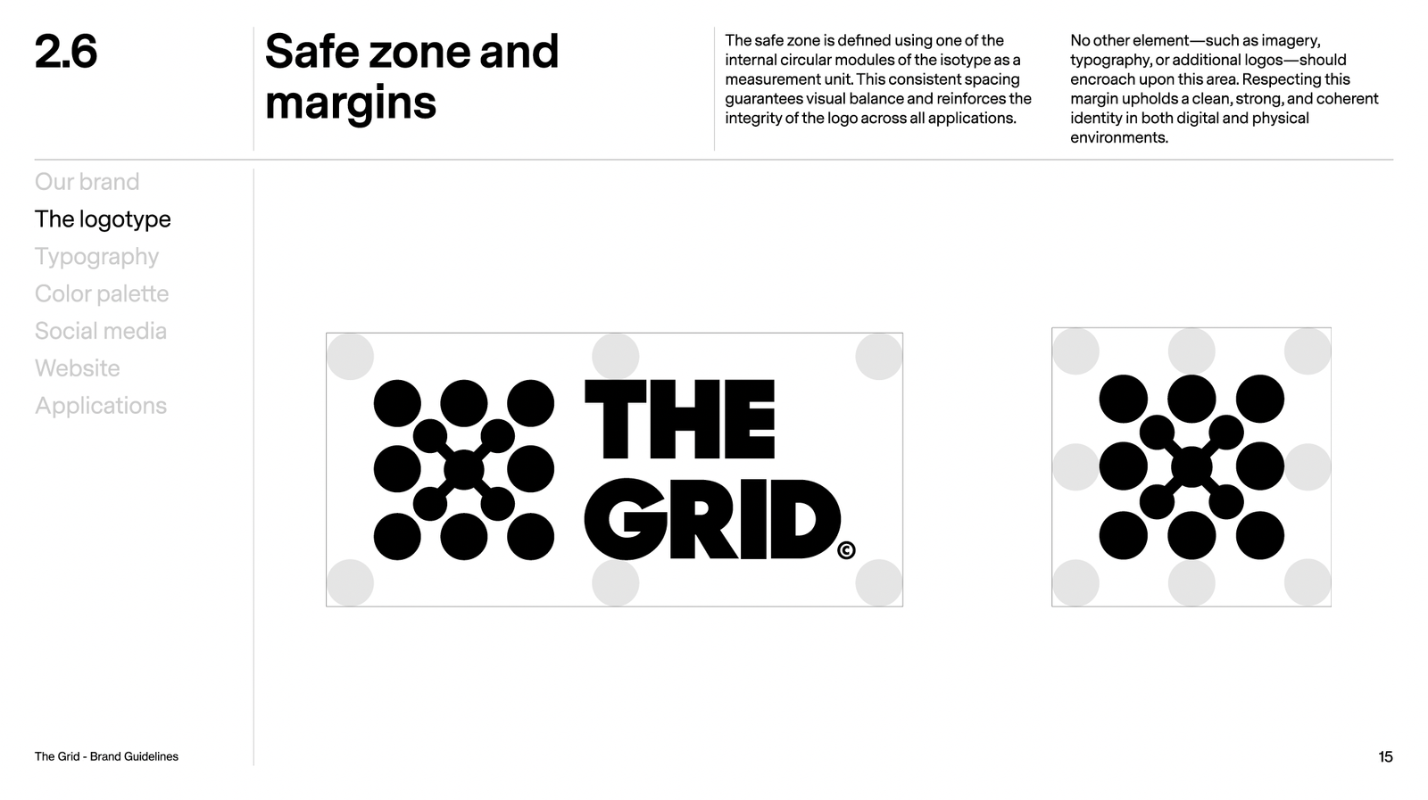
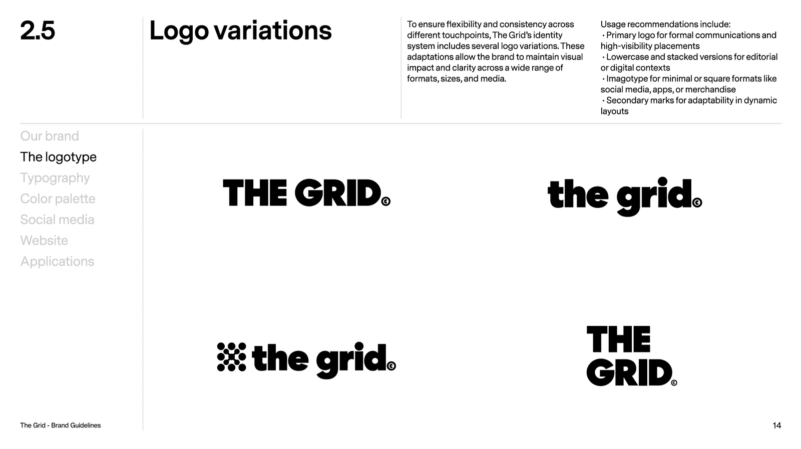
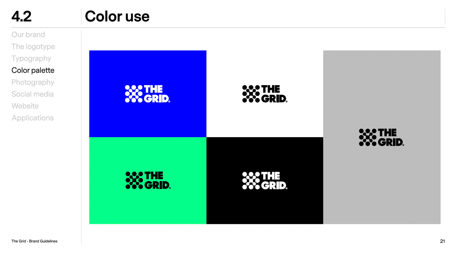
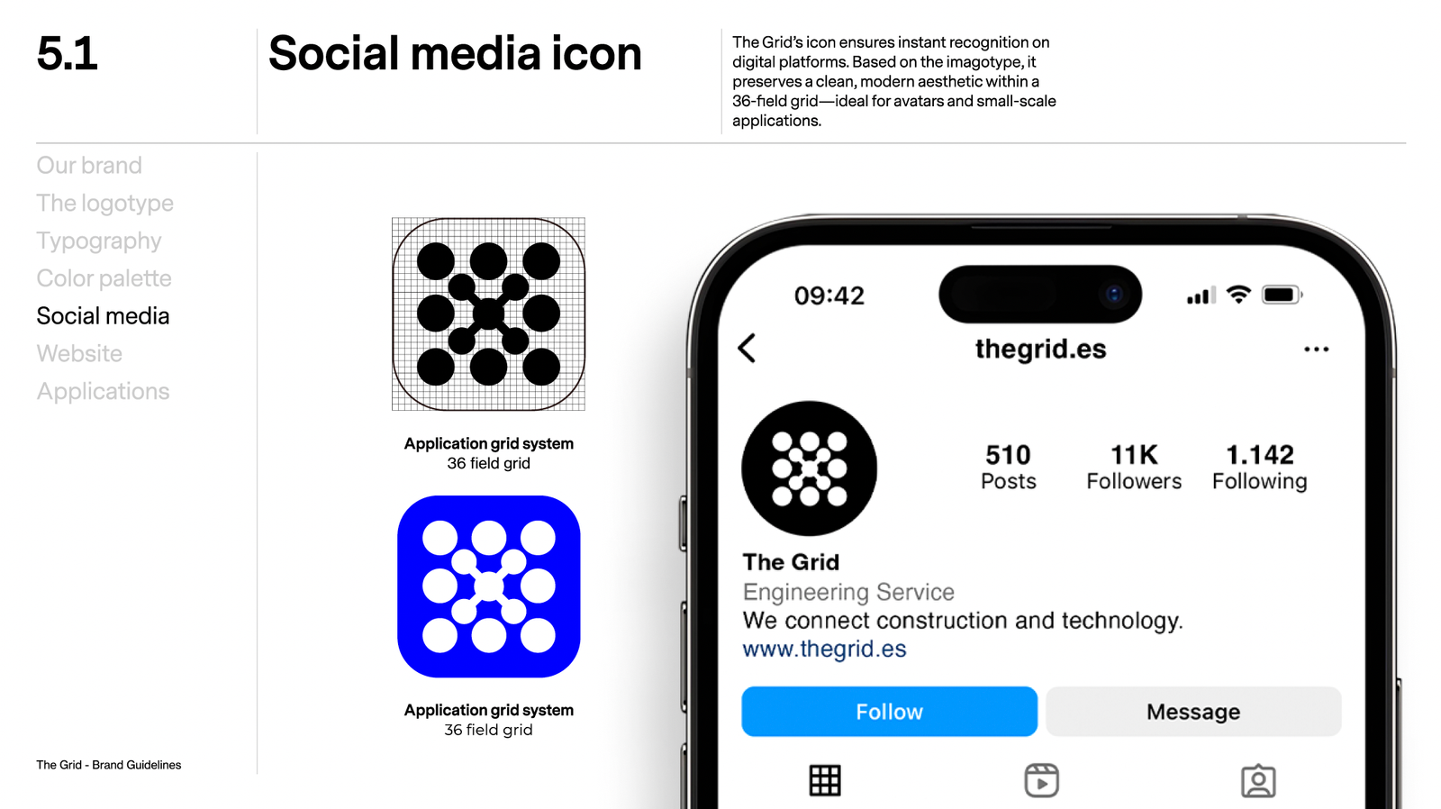
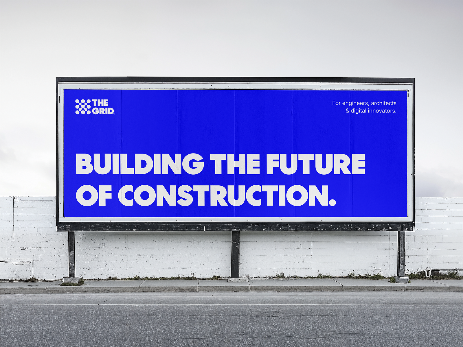
We built a modular brand system (type Centra No.2 + Neue Haas Grotesk, electric blue with mint/black/white/light‑gray accents), clear safe‑zone rules and logo variants (horizontal logotype, isotype/imagotype) for flexibility.
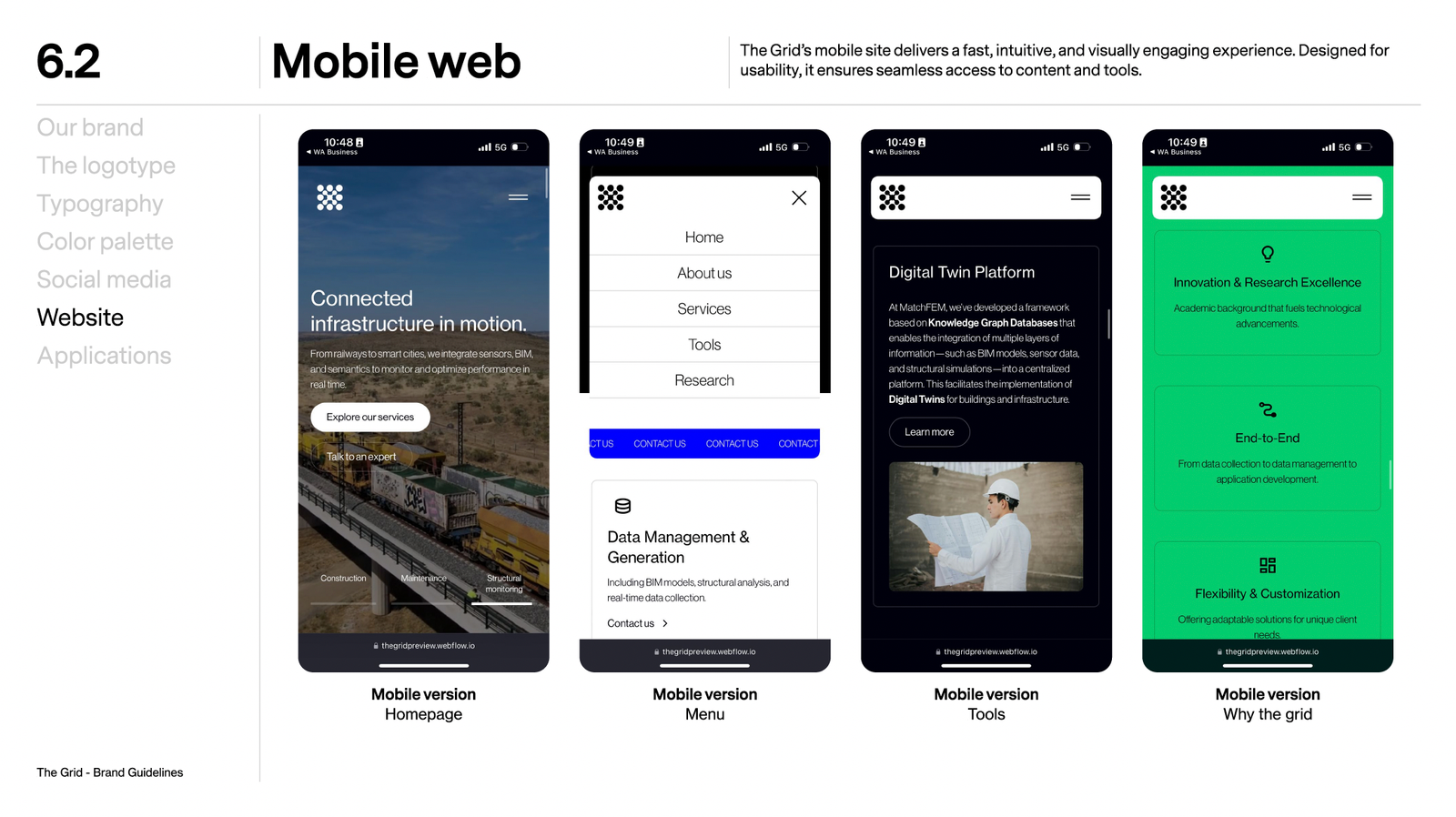
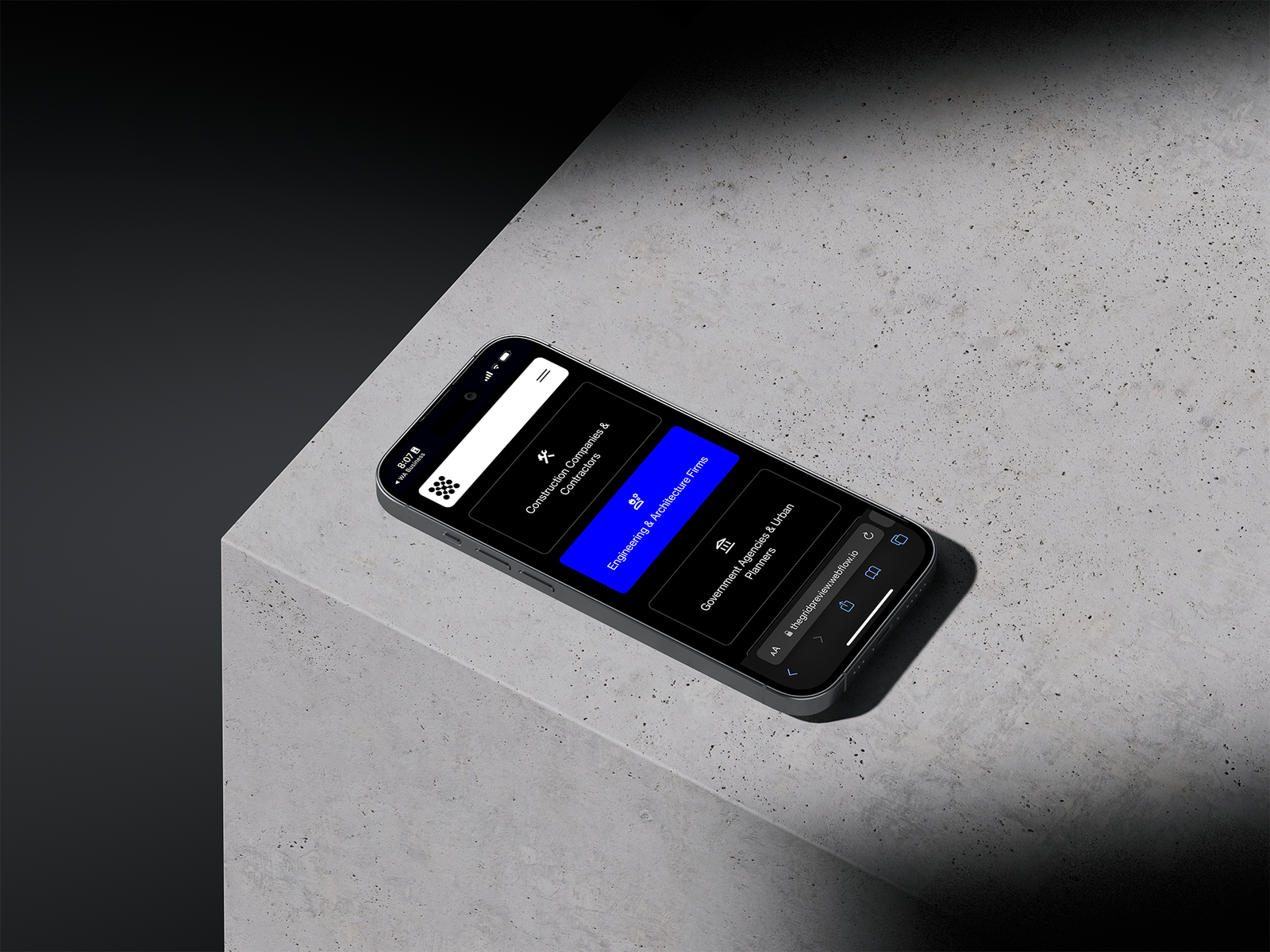
We translated the identity into a fast, intuitive website (clear navigation, large‑scale visuals, subtle micro‑interactions, AA accessibility) that strengthens the connection to digital construction solutions.
Services
- Brand system
- Guidelines
- UI kit
- Webflow development
- Motion
- AA accessibility.
What We Do
- Brand strategy & key messaging: positioning, promise, and a professional‑approachable tone.
- Brand guidelines: usage rules, do’s & don’ts, safe‑zones, scales.
- Identity system: logotype and imagotype/isotype in positive/negative and mono.
- Color system: electric blue primary + mint/black/white/light‑gray; documented AA contrast.
- Typography: Centra No.2 + Neue Haas Grotesk; hierarchy, scales, spacing guidance.
- Layout system & UI components: responsive grid, buttons, cards, navigation, states, subtle motion.
- Website (Webflow): clear site structure; key pages (home, services, cases, contact); CMS for case studies and services.
- Accessibility & performance: AA criteria, best practices; LCP and visual stability goals.
- Technical on‑page SEO: metadata, headings, basic schema, sitemap and robots; copy guidance.
- Analytics & measurement: GA4 and Google Search Console with key events/goals.
Stack
- Figma
- Adobe Illustrator
- Webflow
- Optional Lottie/JSON
- Light GSAP.
Timeline
4–6 weeks
Impact
Consistent brand and site ready for technical use‑cases, metrics, and B2B capture.
Deliverables
- Brand manual (PDF)
- UI library
- Homepage/key section
- CMS webflow collections